Briefing
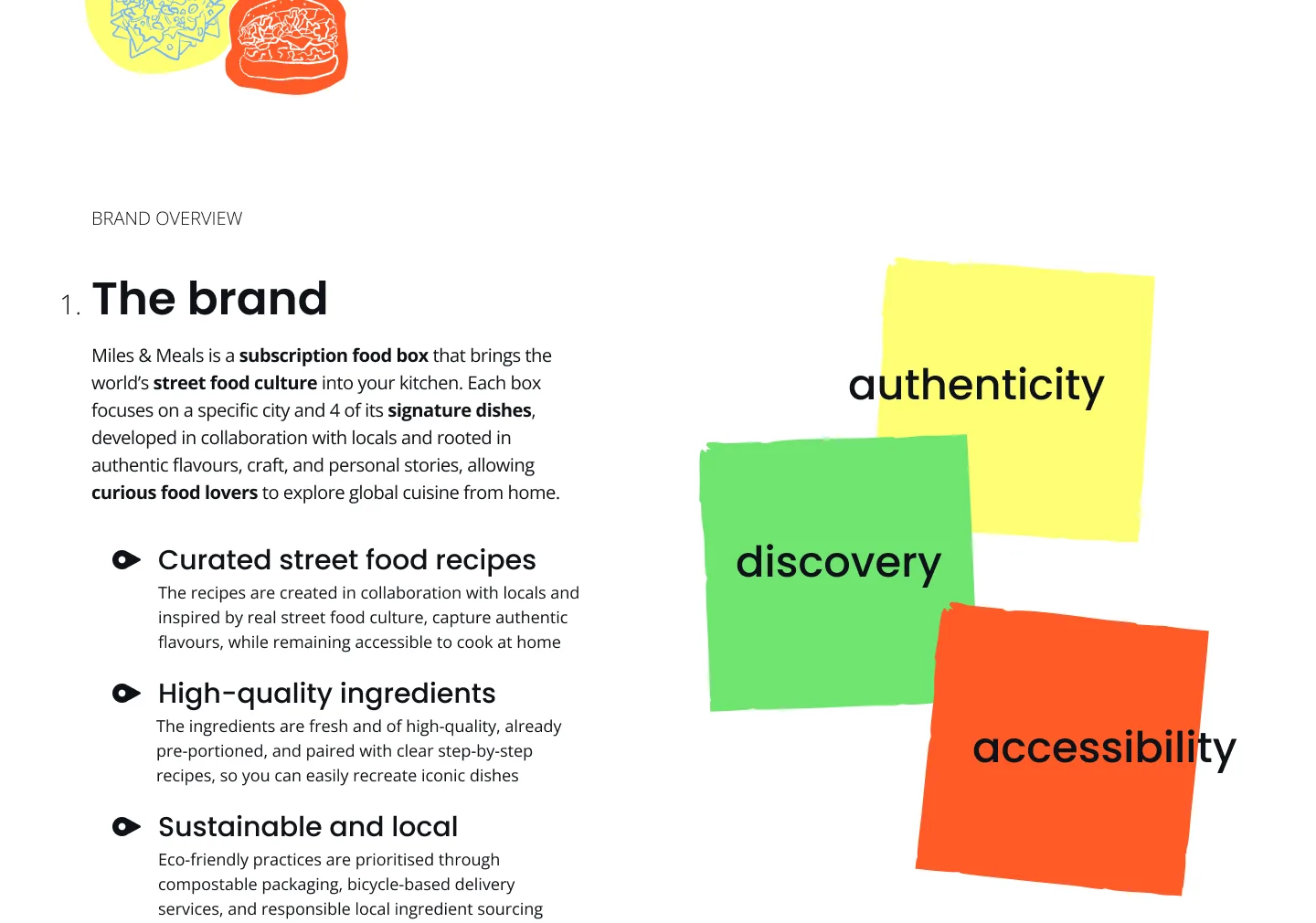
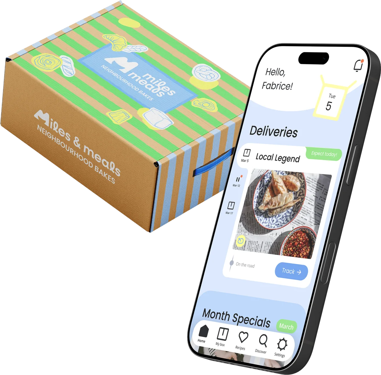
For this assignment, I was tasked with creating the visual identity and app for Miles & Meals, a subscription food box that brings street food from cities around the world into your kitchen. The challenge here was to build a brand from scratch and then carry it into a functional app. The project was divided into two parts:
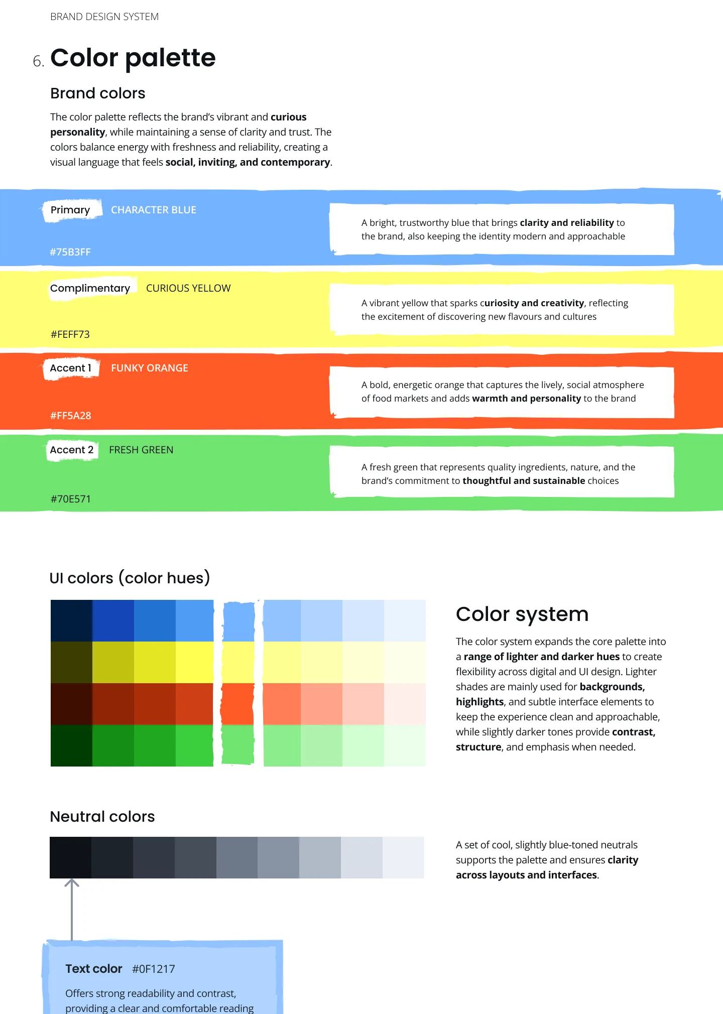
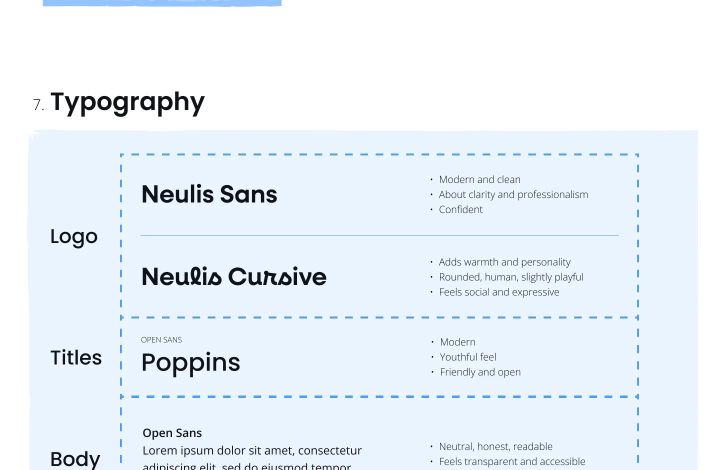
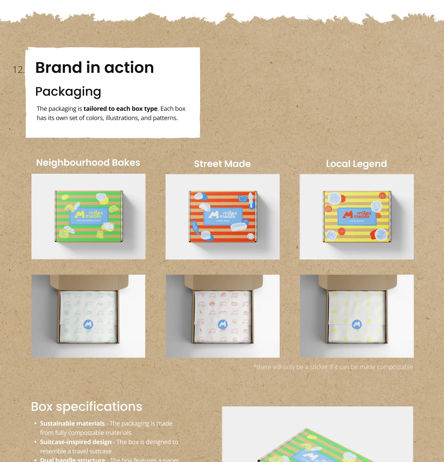
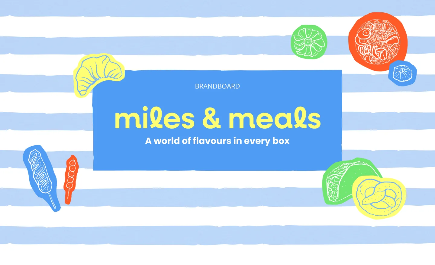
Brandboard
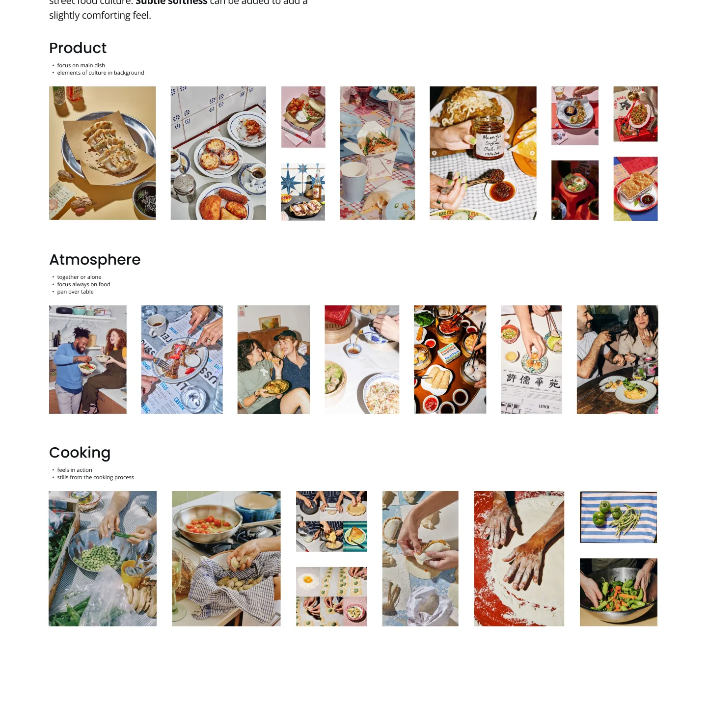
The brand needed to feel curious, social and authentic, without being tied to one country. It's built around three values: authenticity, discovery and accessibility. Great food and new cultures, without a steep learning curve.
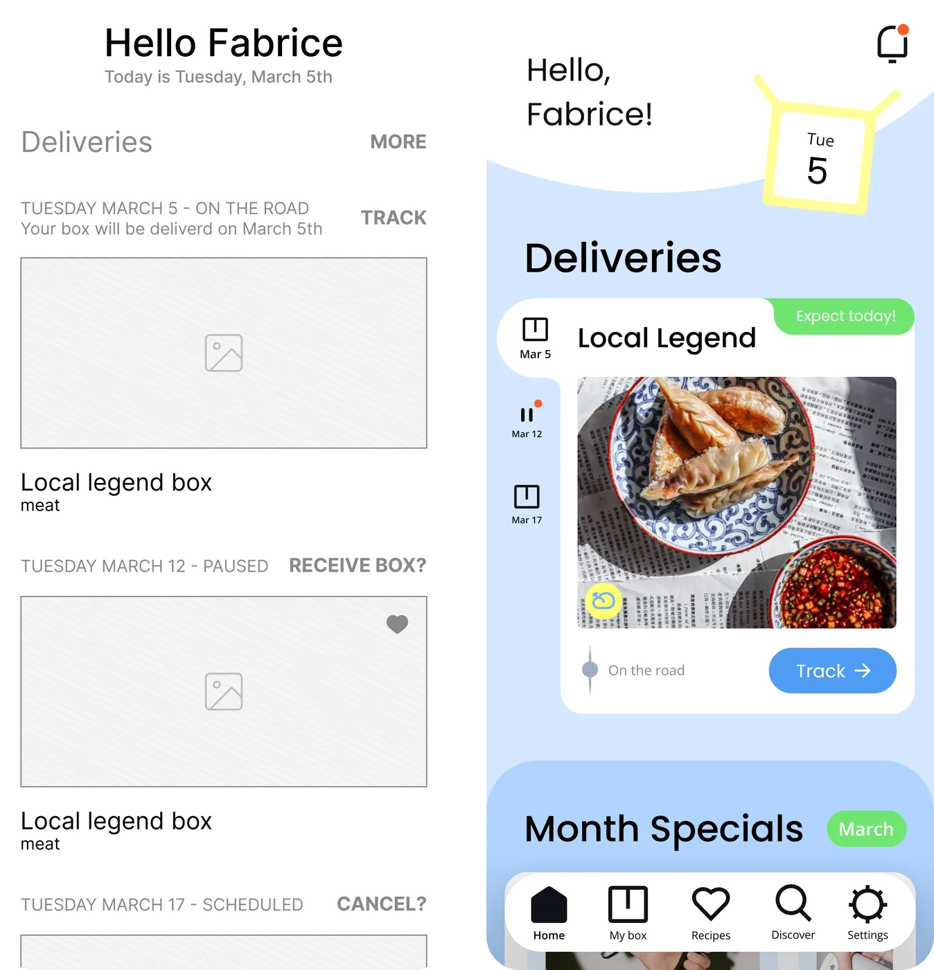
App
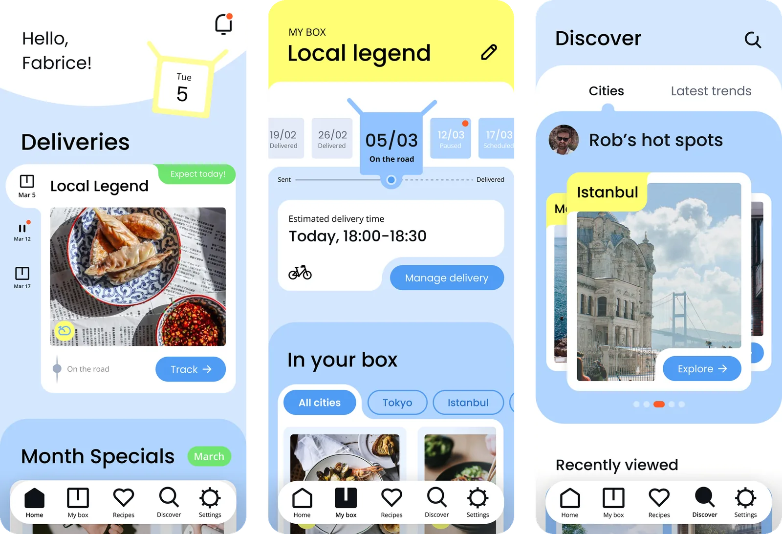
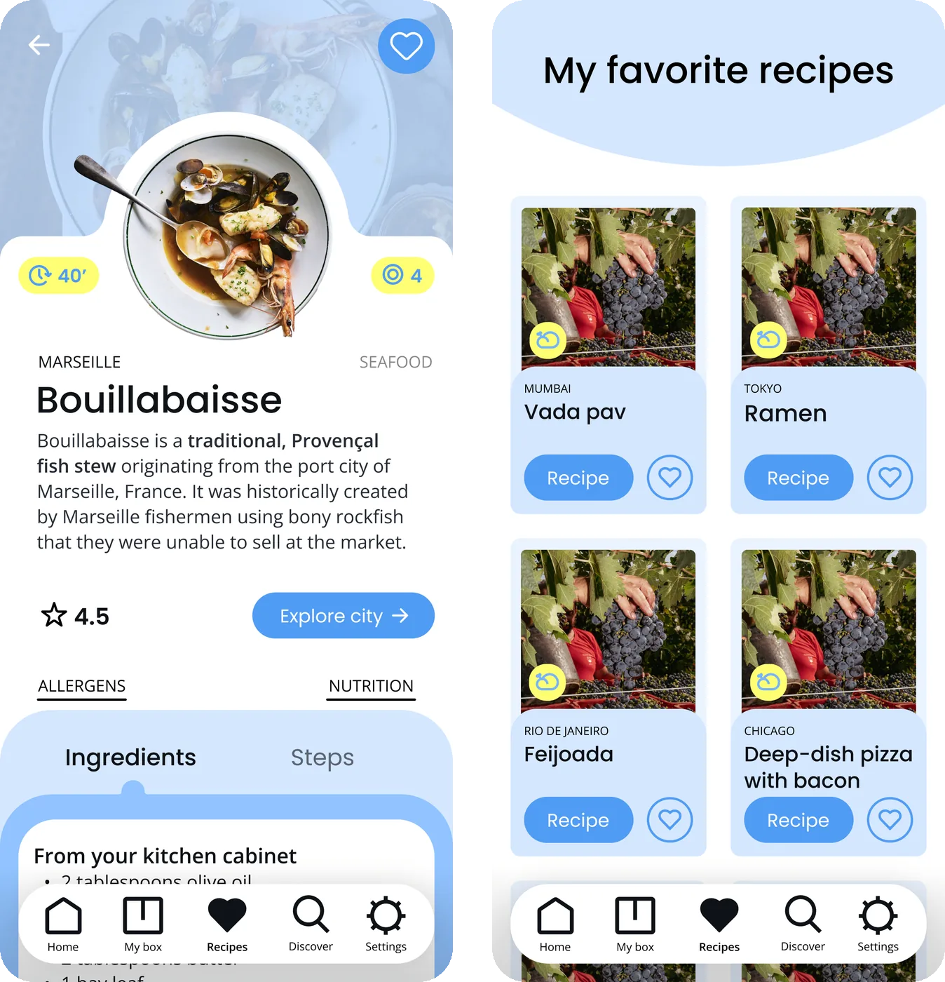
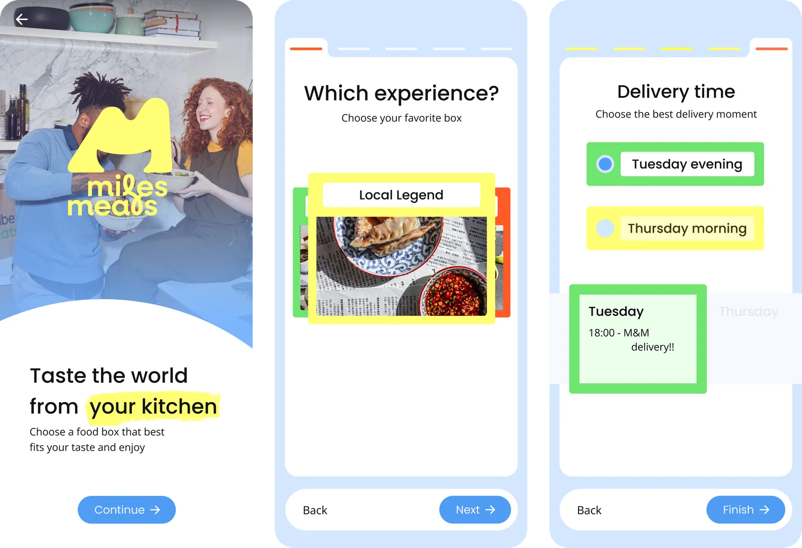
The app had to extend the brand into a digital experience and stay consistent with the brandboard. It allowed users to manage their subscription, cook the recipes step by step and explore new cities. That is why it had to be usable, clearly branded and unique.
Process
Brandboard
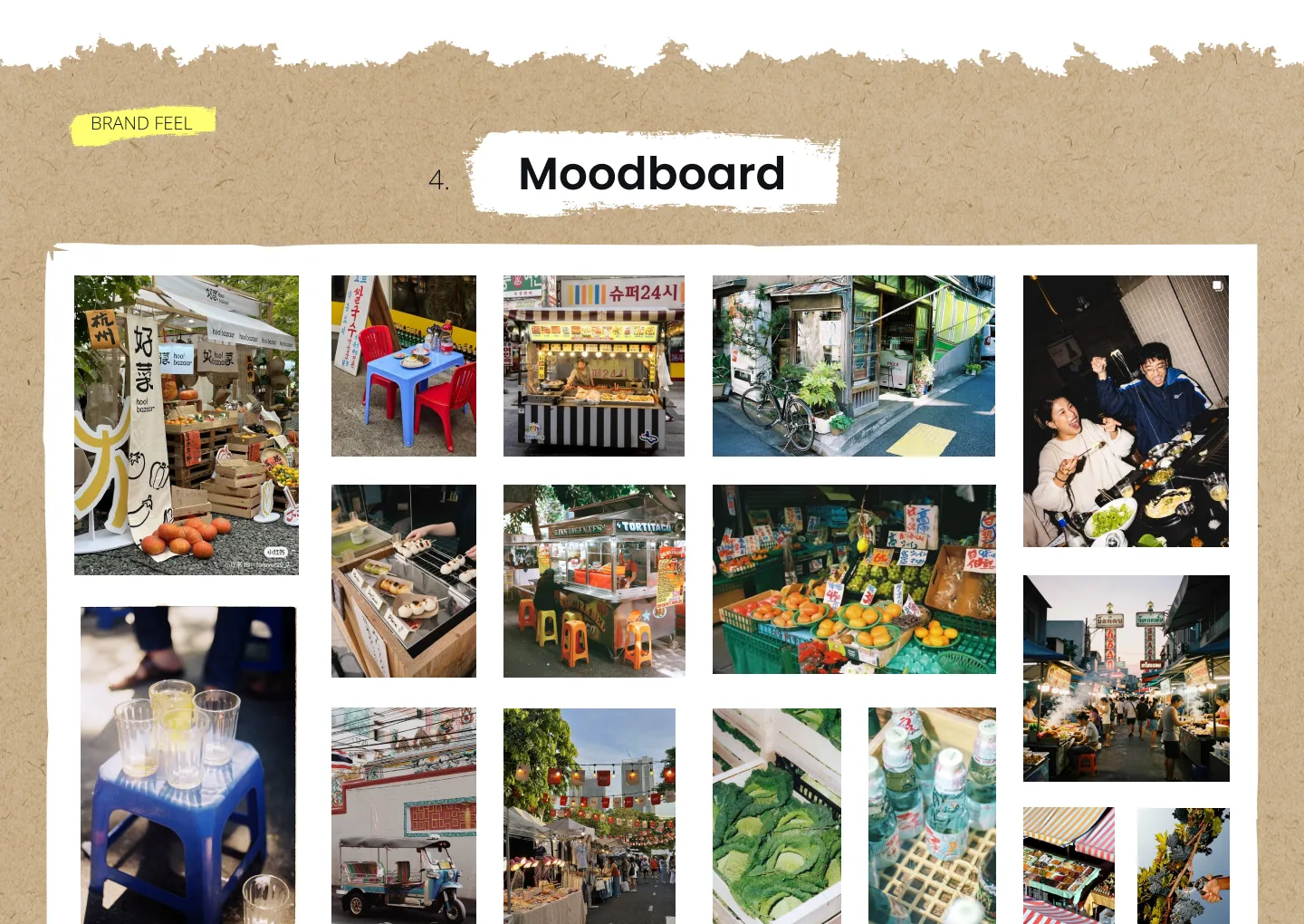
I started by breaking down the brief and exploring what Miles & Meals should represent for its target audience: busy, curious people who love discovering new places and flavours. Through mindmaps and visual research, I explored ideas around discovery, different cultures, cooking, convenience and connection.
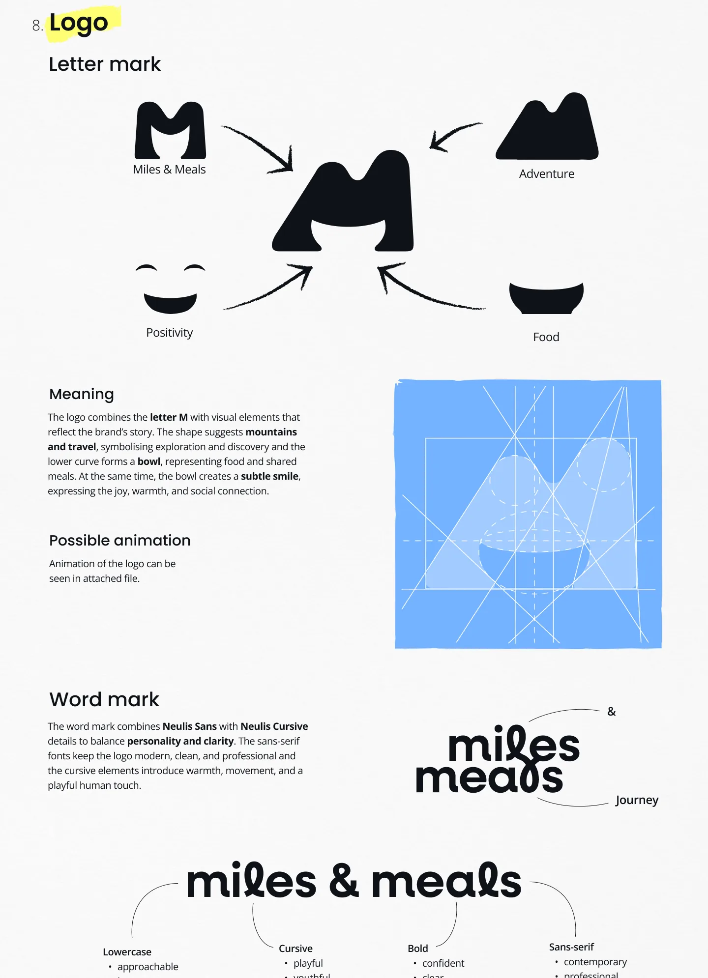
My first design choices were honestly based on what looked nice, rather than what the brand needed to say. I stepped back, did more visual research and brainstorming, and used it to explore and refine the logo, colours, typography and iconography so each choice had a reason behind it. I then applied the identity to packaging and illustrations to test that it worked beyond the brand board.
App
App design was new to me, so I began by studying other apps and how they're structured. I used the feedback from the brandboard to simplify the design and focused on keeping everything consistent. Instead of just applying the style, I questioned the wireframes and reworked layouts to make the experience feel clear, intuitive and easy to use. Small interactions, personalised content and a recognisable visual style made the app feel unique.
Result
See the complete brandboard and a clickable app prototype, created on Figma: